Champs: A Modern Sans Serif Typeface for Digital Clarity
There’s that moment—right after you’ve built the hero section of a new coaching website—when you pause, zoom out, and ask: Does this feel like the brand? I’d just dropped in a placeholder font for the headline “Your Calm, Captured” over a soft gradient background. It worked… but it didn’t breathe. So I swapped it for Champs. Instantly, the layout settled. Not louder—but clearer. Lighter, somehow, yet more grounded. That’s the quiet power of Champs: a modern sans serif typeface that doesn’t shout, but confidently holds space.
What Champs Feels Like on Screen
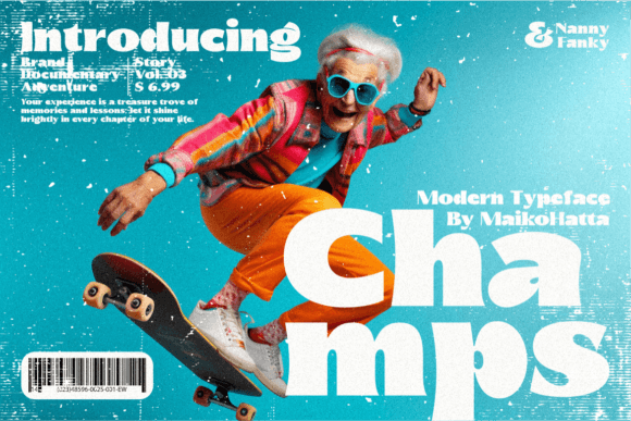
Champs is clean without being cold. Stylish without being fussy. Its letterforms have subtle warmth—gentle curves at terminals, balanced x-height, and just enough openness in counters to keep text airy even at smaller sizes. It’s not a geometric sans (no rigid circles or uniform strokes), nor is it humanist in an obvious way—instead, it occupies a thoughtful middle ground: approachable, professional, and quietly distinctive. As a web designer who tests fonts across real projects—not just mockups—I’ve found Champs shines where digital clarity matters most: hero headlines, section titles, CTA buttons, and brand statements.
How It Performed in Real Layouts
I tested Champs across three live contexts: a boutique online store’s homepage banner, a course sales page’s value proposition section, and a portfolio site’s project cards. In each, it handled contrast beautifully—whether set against a textured photo background, a solid pastel block, or a dark mode interface. On mobile, its generous spacing and legible proportions kept headlines scannable without zooming. At 32px on desktop and 28px on iOS, it retained crispness even with variable font loading delays. And yes—it passed the “squint test”: step back, blur your eyes, and the hierarchy still reads instantly.
One standout use was a “Start Free Trial” button on a SaaS landing page. Champs in Medium weight, all caps, with tight letter-spacing—clean, action-oriented, and uncluttered. No extra styling needed. It looked equally strong in a minimalist footer tagline (“Designed for focus. Built for flow.”) where subtlety mattered more than impact.
Where Champs Fits—and Where It Doesn’t
Champs excels as a display font and heading typeface—not as body copy. I tried it at 16px for paragraph text on a blog post preview, and while readable, it lacked the neutral neutrality of a dedicated UI sans like Inter or system fonts. For long-form content, pairing Champs with a highly legible sans serif font (like Manrope or Lato) creates smart contrast: Champs for voice, the secondary font for function.
It’s also not ideal for dense navigation menus, tiny form labels, or accessibility-critical interfaces where maximum character distinction is non-negotiable. But for branded moments—logos embedded in SVG, campaign headlines, testimonial quotes, or digital brand kits—it delivers consistent tone and polish. I used it for a client’s “Welcome” section on their course dashboard, and the shift in perceived professionalism was immediate—no redesign, just better typography.
Practical Tips for Web Designers
Before dropping Champs into your next project, check what’s included: multiple weights (Light through Bold, ideally with italics), OpenType features like ligatures or stylistic alternates (great for subtle variation in hero text), and robust multilingual support if your audience spans regions. For web use, confirm it’s available as WOFF2 files—and verify licensing covers commercial websites, client work, and SaaS platforms. Most reputable foundries include webfont kits with CSS snippets and fallback stacks, which saves time when optimizing load performance.
For responsive behavior, I recommend using Champs in font-weight: 500 or 600 for headings up to tablet size, then scaling down to 400 for smaller viewports—its structure holds up well. Avoid ultra-light weights below 24px on screen; they can fade on lower-DPI displays. And always test contrast: Champs’ medium contrast works reliably against light and dark backgrounds, but avoid pairing it with low-contrast color combos (e.g., charcoal on slate gray) without checking WCAG AA compliance.
Pairing It With Purpose
Champs plays well with others—especially fonts that complement rather than compete. For editorial-style sites, I paired it with a warm, low-contrast serif like Cormorant Garamond for blog headers and pull quotes—Champs for energy, the serif for depth. For product dashboards or clean e-commerce sites, it pairs seamlessly with a neutral sans serif font like Poppins or Rubik for body and UI elements. And if your brand leans creative or personal? Try a restrained script font (like Quiet Sans) for accent phrases—just one per page—to add warmth without clutter.
What makes Champs especially valuable for digital product creators is how it bridges personality and practicality. It’s not a trend font—it’s a tool that supports intention. Whether you’re launching a new brand kit, refining a landing page conversion path, or building a portfolio that reflects your design maturity, Champs gives you confidence in the details. It doesn’t distract. It doesn’t overpromise. It simply makes your message easier to see—and remember.