Hexaby: A Modern Serif Font for Polished Digital Branding
Two weeks ago, I was refining the hero section of a new coaching website — clean layout, soft background image, and a headline that needed to feel both grounded and elevated. I’d cycled through six fonts already: some too stark, others too ornate, a few that vanished on mobile. Then I loaded Hexaby. Instantly, the headline settled — not loud, not shy, but quietly confident. That’s when I knew this wasn’t just another serif font. It was the right kind of quiet.
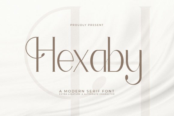
Hexaby is a contemporary serif typeface built for digital clarity without sacrificing character. Its letterforms balance clean verticals with gentle curves — think of the subtle swell in the ‘a’, the refined bracketing on the ‘e’, or how the lowercase ‘g’ holds its shape without tipping into old-style formality. It’s not a revival, nor is it minimalist abstraction. It’s something more intentional: a serif designed for screens first, then refined for print and brand expression.
In practice, Hexaby shines where tone matters most: hero headlines, section titles, testimonial quotes, and branded call-to-action buttons. On the coaching site, I used it at 48px for the main headline over a muted gradient — legible even with reduced contrast settings. For subheadings, I dropped to 28px and kept line height open (1.4), letting the rhythm breathe. It didn’t compete with the imagery; it anchored it.
What surprised me was how well it performed in smaller UI contexts. I tested Hexaby at 16px for a secondary CTA button (“Start Your Session”) — slightly bolder weight, tight letter-spacing, white text on charcoal. No blurring. No edge-halos. Just crisp, trustworthy presence. That’s rare for a serif in interface roles. Most serifs soften or pixelate below 18px, but Hexaby’s hinting and x-height keep it sharp across devices — especially on iOS Safari and newer Android browsers.
For responsive layouts, I found Hexaby scales gracefully. At 768px, I switched from 48px to 36px with adjusted tracking (+20). At 480px, it became 28px — still commanding, never cramped. On dark mode, it held warmth without washing out (I avoided pure black backgrounds, opting for #121212 instead). Over light image overlays, I added a subtle text shadow (0 1px 2px rgba(0,0,0,0.15)) — just enough to ensure readability without undermining its elegance.
Hexaby isn’t meant for long-form body copy — and it doesn’t pretend to be. Its strength lies in emphasis, not endurance. I paired it with a neutral, highly legible sans serif (Inter, set at 16px/1.6) for paragraphs and navigation. The contrast worked beautifully: Hexaby brought voice and distinction; Inter delivered clarity and flow. This pairing mirrors how many editorial sites operate — think high-end blogs or boutique newsletters where the headline feels like a signature, and the body feels like a conversation.
It also works elegantly in supporting roles beyond headers. I used Hexaby’s italic variant for pull quotes in a course sales page — not as decoration, but as visual punctuation. Its slant is restrained, never dramatic, so it guides attention without disrupting reading order. On a portfolio homepage, I applied it to project category tags (“Branding”, “Web Design”, “Identity Systems”) in all caps at 14px — tight, dignified, instantly scannable.
One thing I appreciated: Hexaby ships with a full range of weights (Light, Regular, Medium, SemiBold, Bold) and true italics — no faux-italic rendering. That meant I could fine-tune hierarchy without switching families. For example, I used Medium for H2s, Bold for primary CTAs, and Light for delicate captions under hero images. No awkward jumps in stroke contrast or rhythm.
I also checked multilingual support before finalizing — the version I licensed includes Latin Extended-A, basic Greek, and Cyrillic characters. Not exhaustive, but sufficient for English-first sites with occasional European names or terms. If you’re building for broader language needs, verify coverage early. And yes — it’s a commercial font, so I confirmed the web license included WOFF2 delivery, variable font options (where supported), and unlimited domains for client work. No surprise fees, no embedding restrictions.
Where does Hexaby fit best? Think of it as your go-to serif for moments that need intention: a luxury skincare brand’s product landing page, a designer’s portfolio intro, a thoughtful newsletter banner, a course sales header that says “this matters” before the first sentence. It’s less suited for fast-scrolling social ads (where ultra-bold sans serifs dominate) or dense dashboards (where monospace or system fonts win). But for any digital space where brand voice is part of the UX — yes, absolutely.
It also plays well in design systems. I added Hexaby to the typography scale in Figma, defined clear usage rules (“H1–H3 only”, “buttons: Bold, 16px max”, “never below 14px”), and documented fallbacks (Georgia, serif). That consistency helped the client quickly recognize their own voice across pages — not just visually, but emotionally. Users don’t name fonts, but they feel their confidence. Hexaby delivers that without shouting.
If you’re choosing a serif font for your next web project, ask yourself: Does it need to feel timeless *and* current? Does it need to stand out without overwhelming? Does it need to hold up in motion — in hover states, micro-interactions, or scroll-triggered reveals? Hexaby answers yes — thoughtfully, cleanly, and without compromise. It’s not flashy. It’s focused. And sometimes, the most powerful design decisions are the ones that simply feel inevitable.