Vhinegar: A Modern Serif Font for Digital Branding
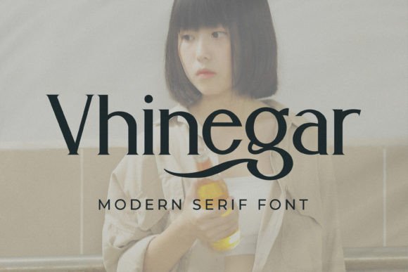
As a UI designer who ships landing pages, SaaS dashboards, and e-commerce experiences daily, I pay close attention to how typefaces shape perception before a single word is read. Vhinegar stands out—not as a nostalgic serif, but as a refined, contemporary serif font built for clarity, character, and digital intentionality. Its balanced proportions, open counters, and subtle contrast give it quiet authority without sacrificing warmth. It’s not overly decorative, yet never generic—a rare balance in modern typography.
Vhinegar works best where you need voice and visibility: hero section headlines, logo lockups, product name treatments, and premium packaging mockups. Its strong vertical stress and confident x-height ensure legibility even at smaller sizes on high-DPI screens—critical when scaling across mobile headers, app onboarding slides, or Shopify banner text overlaid on lifestyle imagery. Unlike many display serifs that blur or lose rhythm below 24px, Vhinegar maintains crispness down to 18px in bold weights, making it viable for prominent CTAs, feature cards, or testimonial quotes within scroll-driven layouts.
In visual hierarchy, Vhinegar excels as a primary typographic anchor. Use it for H1s and branded section titles—then pair it deliberately. For body copy, choose a neutral sans serif (think Inter, Manrope, or a well-hinted system font stack) with generous line height and letter spacing. This pairing reinforces editorial polish while preserving scannability. On a coaching website, Vhinegar in bold caps for “Your Next Breakthrough Starts Here” paired with clean, left-aligned paragraph text creates instant credibility and focus. In a boutique online store, it elevates product names like “Ceramic Pour-Over Set” without competing with photography or color.
It’s also highly effective in conversion-focused contexts—when tone matters as much as clarity. A course sales page benefits from Vhinegar’s confident rhythm in headline variants (“Master Typography in 6 Weeks”) and supporting subheads (“No design degree required”). The font’s restrained elegance signals quality and intention, helping users associate your offering with craftsmanship rather than commodity. That impression directly supports trust-building—especially important for digital products where users can’t physically inspect materials or build.
Vhinegar includes multiple weights (Light to Bold), true italics, and OpenType features like ligatures and stylistic alternates—essential for fine-tuning web typography. These aren’t just flourishes; they let you adjust rhythm across breakpoints. For example, use the Light weight with increased tracking for elegant footer credits on light backgrounds, or switch to Bold Italic for pull quotes in blog layouts. The font supports Latin-based languages and includes extended punctuation, making it suitable for global-facing SaaS dashboards or multilingual brand kits.
On dark mode interfaces, Vhinegar performs reliably—but avoid ultra-thin weights on low-contrast backgrounds. Stick to Regular or Bold for headings over dark gradients or deep navy overlays. For buttons, use Bold at 16–18px with 0.5px letter-spacing and ample padding; its sturdy terminals prevent visual “fading” against busy backgrounds. On mobile, test rendering at 320px width: Vhinegar’s generous spacing and clear glyph shapes hold up better than tightly spaced serifs or condensed display fonts.
Where Vhinegar shines most is in reinforcing consistent online identity. Think beyond static logos: it scales into dynamic contexts—animated loading states, interactive hover effects on navigation items, or SVG-based icon labels in admin panels. When used across your Figma design system, CSS variables, and live site, it becomes part of your brand’s behavioral language. A creative portfolio site might use Vhinegar for project titles and client names, then switch to a geometric sans for case study body text—creating rhythm without visual fatigue.
Font pairing matters, especially for responsive readability. Avoid stacking two decorative fonts. Instead, treat Vhinegar as your expressive lead—and keep secondary type functional. For editorial blogs or content-rich dashboards, pair it with a robust, accessible sans serif that passes WCAG contrast requirements at all sizes. Never force Vhinegar into long-form paragraphs: its personality is strongest in short, intentional bursts—headlines, quotes, callouts, and branding elements.
Licensing is practical, too. Vhinegar is a commercial font with webfont-ready formats (WOFF2, WOFF), meaning it embeds cleanly via @font-face or font hosting services. For client work, verify license scope—most include unlimited web projects, digital templates, and SaaS usage, but always check redistribution rights if you’re building white-labeled tools or theme marketplaces. Self-hosted webfonts give you full control over loading behavior, critical for Core Web Vitals.
Real-world examples prove its versatility: a sustainable homewares brand uses Vhinegar for product tags and shopping bag print mockups—then echoes its curves in custom SVG icons. A newsletter platform applies it to email subject lines and dashboard welcome banners, creating continuity between inbox and interface. A freelance designer includes it in their brand kit PDFs and Notion client onboarding docs, ensuring visual cohesion across touchpoints.
Vhinegar isn’t about being “trendy.” It’s about having a serif font that behaves predictably across devices, conveys maturity without stiffness, and supports your message—not overshadows it. In an ecosystem crowded with variable fonts and AI-generated type experiments, its thoughtful construction and restrained confidence make it a reliable asset—not just another download.
If you’re selecting a serif font for your next digital product, ask: Does it support scanning? Does it scale without distortion? Does it reflect the tone your audience expects—not just what looks “designer-y”? Vhinegar answers yes—to all three.